Vanguard Careers
Vanguard is a global company in financial and investment management. In this project, I modernized and improved the career site to make it easier for job seekers to find information and apply to jobs at Vanguard.
Problem
The Vanguard career site does not reflect or connect with present brand style. Job seekers struggle to find relevant and current information.
Solution
ROLE
Product Designer
TEAM
3 designers, 1 strategist,
1 researcher, 4 engineers
DELIVERABLES
IA, usability test, wireframes, prototypes, design system
DURATION
May - Oct 2023 (6 months)
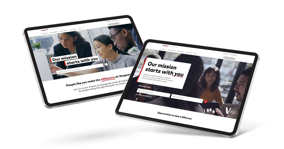
Design a new career site and design system to promote user engagement and support site management.
The process
To further understand the user problem, we conducted a site audit, competitive, analysis, and tree testing. After an assessment of the site content and component needs, we developed wireframes for 3 prominent page templates: home page, job search page, and job description page. Next, we tested 2 different UI concepts (safe vs. bold) to provide our stakeholders with diverse options. Finally, we combined the 2 concepts and refined components for the new design library.
Identifying gaps & opportunities

Original Vanguard career site: homepage, job search page, job description page (left to right)
We conducted a competitive analysis and site audit to identify gaps and opportunities on the career site. During this process, we reviewed 27 competitor career sites, documenting elements that worked well. We also conducted internal audits across various Vanguard sites to examine the brand’s repository of components. Throughout the audit, we highlighted different types of components and treatments, such as hero spots and content blocks, which served as sources of inspiration. Our analysis allowed us to pinpoint areas for improvement, paving the way for a more user-centric and impactful experience.

Our figjam analysis and audit board
Key Insights:
-
Disconnected design and experience from the rest of the Vanguard digital experiences.
-
Difficulty managing components and content by the internal HR team.
-
Lack of representation of all career life stages and candidates.
-
Need for better visibility and more thoughtful search experience.
-
Homepage content lacking priority and personalized context.
-
Missing opportunity for the job description page – the most visited page – for Vanguard values, leaving the recruiter trying to fill the gap.
-
Elevating Vanguard’s Accessibility promise, including features such as video carousels, alt image tagging, and the ability to view the video and transcript at the same time.
-
Considerations regarding responsive design
Re-imagining our global header
We re-prioritized our global header to improve the candidate experience. For instance, we highlighted every stage of career growth through the candidate’s perspective to provide a more relatable and personalized narrative. Another improvement is that we surfaced our benefits prominently, enabling us to tell our own story and showcase unique advantages of joining Vanguard. We also led with transparency around the application process, so candidates know what to expect.

New navigation vs old navigation
We arrived at our final navigation through a series of iterations and tree testing sessions. Tree testing evaluates how well users can find info through site navigation. We iterated on the areas that testers took more time to find.
By the end of our evaluation process, we achieved a 85% success rate of participants locating the job application section and an 80% accuracy rate in identifying information related to key job topics. Consequently, our streamlined site navigation significantly reduced friction, enhancing the user experience across both top and lower-level pages.
Establishing the IA
In order to enhance our information architecture, we categorized content into new page template types, which were determined through a comprehensive content audit. Content within these pages can be built using versatile components that can be inserted anywhere throughout the site. In addition, we broke down our component needs, exploring net new components that are specific to careers and all other components that leverage the existing Vanguard design system.

Career site IA
Wireframing our page templates
After identifying page template types, we created wireframes for 3 main pages: job description page, home page, and job search results page. Our research highlighted that these pages accounted for the starting point for 75% of all site visits. Within these wireframes, we carefully pinpointed key opportunities to prioritize the candidate. By creating page wireframes, we can discern which components are user-friendly and best suited for the new career site later on.
Key features:
-
Enhanced search and filtration capabilities
-
Better job discovery features (ex. location-based or job-based)
-
Streamlined application process (quick apply and talent network)
-
Flexible content blocks

Wireframes for homepage, job search page, and job description page (left to right)
Safe vs. bold UI concepts
After finalizing the wireframes, we delved into the UI phase, presenting 2 distinct concepts on the homepage, job description page, and job search page to our stakeholders. While both concepts adhered to the brand image, they differed in safe vs. bold directions.
Concept 1
The safe concept exhibits a clean and playful aesthetic, featuring overlapping graphic touches that seamlessly places the candidate into the Vanguard environment. It prioritizes transparency by exposing all of the content upfront, and adopts a softer side of design through the use of illustration.

Concept 1 wireframes for testing
Concept 2
The bold concept offers an immersive, dynamic, and powerful experience. It brings the candidate front and center by focusing on lifestyle imagery and using hand-drawn elements (a later addition). This concept celebrates the individual through their unique milestones and puts the candidate in the spotlight.

Concept 2 wireframes for testing
Evaluating usability
User testing played a pivotal role in refining our design concepts. During this phase, 120 participants interacted with prototypes of the 2 concepts. Our evaluation focused on engagement and usability, providing valuable insights that guided our subsequent iterations.
Homepage findings
-
10% more captivating to use hero spot in bold concept → video hero spot drives instant engagement
-
4% more intuitive to use 2-filter (keyword + location) job search
-
4% more engaging to use immersive tab component in crew stories → Immersive photos and colorful design elements enhance visual appeal
Job search findings & recommendations
-
19% more intuitive to separate search from filter options → Prominent search field at top of the page makes it more easier to search for jobs
-
11% more engaging to use background design in page header → Pops of color enhance overall visual appeal
-
13% more appealing to use cards than table
Job post findings & recommendations
-
19% less disruptive to use on-page “stay in touch” card than “before you apply” pop up modal
-
17% more significant to group benefits information together than to display benefits individually
-
10% more preference for quote design in bold concept than safe concept → Use larger images to draw attention
-
6% more useful to provide anecdotal career progression than to show general career progression
Iterating based on findings & feedback
After undergoing multiple iterations based on user testing, we further refined our concepts to align with our EVP (Employee Value Proposition) campaign. Our objective was to create a cohesive experience between the career site and the campaign direction, ensuring a smooth transition for potential candidates. Notable additions from the campaign included use of hand-drawn elements, notches, and vibrant red accents.

Example iteration of concept 1 homepage: test wireframe vs. final wireframe


Unifying the concepts
Following stakeholder feedback, we combined the strongest components from each concept into a unified design. This approach enabled us to comprehensively address our component requirements and add them to the career site design library, so that other teams can construct their own pages.
From concept 1, we applied the event cards, illustration/icon/type teasers, and 2-filter search component. From concept 2, we used the hero spot treatment, video component, card style, and career progression timeline. A new request or addition was the social component, which we created to be more evergreen, eliminating the need for live feed updates.

Combined concept - stripped components
Packaging the components
We compiled an inventory of the 31 new responsive components that we designed. These components include hero spot, card, banner, button, icon, filter, video, carousel, timeline, and quote. For phase 2 of the project, we will continue to refine them and detail their specifications.

Inventory of new components. Considering responsive breakpoints and leveraging Vanguard design system.
Learnings
It was refreshing working on an enterprise project, compared to the financial pages that I'm typically responsible for. I had the opportunity to collaborate and exchange ideas with other teams across the company. Throughout the project, I learned how to problem-solve and iterate on the spot to tackle 'dark UX.' I also learned to communicate with stakeholders and improve designs based on the feedback we got from users. Although the project went through delays due to scheduling and large amount of people involved, I was able to practice patience and thoroughness instead of rushing to a final product.


👋 Hope to hear from you soon!